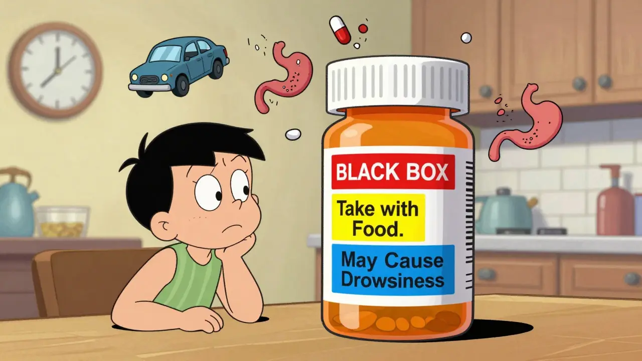
Ever opened a new prescription and stared at the little sticker on the bottle like it’s a cryptic code? You’re not alone. Those tiny warnings - "Do not crush," "Take with food," "May cause drowsiness" - are meant to keep you safe. But too often, they confuse more than they help. A 2022 study found that nearly two out of three people have ignored at least one warning on their medication label. And it’s not because they’re careless. It’s because the language is unclear, the symbols are misleading, and the information is buried under legal jargon.
What Those Stickers Are Really For
Prescription label warnings aren’t random notes. They’re legally required safety alerts, mandated by the U.S. Food and Drug Administration (FDA). Every prescription bottle in the U.S. must carry warnings that prevent serious harm - things like allergic reactions, dangerous drug interactions, or life-threatening side effects. These aren’t suggestions. They’re the last line of defense between you and a preventable medical emergency.The most serious warnings are called Black Box Warnings. These are printed in a bold, boxed format at the top of the prescribing info and appear on the label as a small red sticker or bold text. They’re used when a drug carries a risk of death or severe injury. About 40% of new drugs approved between 2013 and 2017 had one. If your pill has this, it doesn’t mean you can’t take it - it means you need to know exactly how and why you’re taking it. Ask your pharmacist: "What’s the biggest risk here?"
Color Matters - But Not How You Think
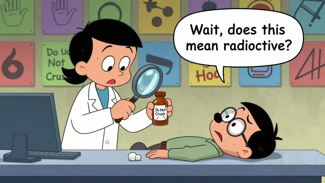
You’ve probably noticed some labels are red, others are yellow or blue. Many people assume red means "danger," yellow means "caution," and blue is just "information." That’s the idea pharmacies use - and it mostly works. A 2017 study showed 85% of patients correctly understood a red sticker meant "serious risk." But here’s the problem: not every pharmacy uses the same system. Some use white stickers for everything. Others print warnings directly on the bottle in tiny font. If you’re relying on color alone, you’re guessing.What’s worse? Symbols. A simple icon of a hand with a line through it might mean "do not crush" - but 32% of patients thought it meant "radioactive." Another symbol for "take with food" was mistaken for "avoid sunlight." The FDA finally approved a standardized set of icons in early 2023 to fix this. But don’t expect every pharmacy to use them yet. Until then, never trust a symbol without reading the words next to it.
Common Warnings - And What They Actually Mean
Here’s what the most common warnings really say - not what you think they say:- "Take on empty stomach" = Wait at least one hour before or two hours after eating. Food can block absorption. If you take your thyroid med with breakfast, it won’t work.
- "Take with food" = Eat something, even a cracker. This isn’t about digestion - it’s about preventing nausea or stomach damage. One study found 42% of people ignored this and ended up with ulcers or vomiting.
- "Refrigerate" = Keep it between 2°C and 8°C (36°F-46°F). If it’s sitting on your counter for days, it could lose potency. Some antibiotics become toxic if not kept cold.
- "Do not crush or chew" = Swallow whole. Crushing a time-release pill can dump the full dose at once. That’s how people overdose on opioids or blood pressure meds.
- "Avoid alcohol" = Don’t drink. Even one drink can cause dizziness, liver damage, or sudden drops in blood pressure. This isn’t a suggestion - it’s a medical warning.
- "May cause drowsiness" = Don’t drive, operate machinery, or make important decisions. This isn’t just "be careful." It’s a safety risk. One patient told a pharmacy they ignored this warning and nearly crashed into a tree.
And here’s the kicker: the FDA says 30-50% of adverse drug events could be prevented if patients understood these labels. That’s hundreds of thousands of trips to the ER every year - avoidable.
Why You’re Still Confused
The system isn’t broken - it’s outdated. Most warning labels were designed for doctors, not patients. They use terms like "contraindicated," "adverse reaction," and "hepatic impairment." The average American reads at a 7th-grade level. The FDA admits 80 million adults have trouble understanding health info. And most pharmacies don’t have time to explain.Pharmacists are stretched thin. The average patient spends 7-12 seconds looking at their label. That’s less time than it takes to read this paragraph. Meanwhile, 68% of patients throw away the printed Patient Prescribing Information sheet - the one with all the real details - thinking it’s just junk mail.
Some pharmacies are trying to fix this. Kaiser Permanente ran a pilot with simplified labels: short sentences, big fonts, plain language. Comprehension jumped from 55% to 89%. Walgreens’ "Medication Safety Check" program now includes a 3-minute verbal review with every new prescription. Patients there understand warnings 92% of the time. But most independent pharmacies? They’re still using the same 20-year-old templates.
What You Can Do Right Now
You don’t have to wait for the system to change. Here’s how to protect yourself:- Check the pill. Does the color and shape match the description on the label? If it looks different, ask. Pills can be switched without your knowledge.
- Read the sticker, not just the bottle. Flip the bottle over. Look on the side. Warnings are often hidden where you won’t see them.
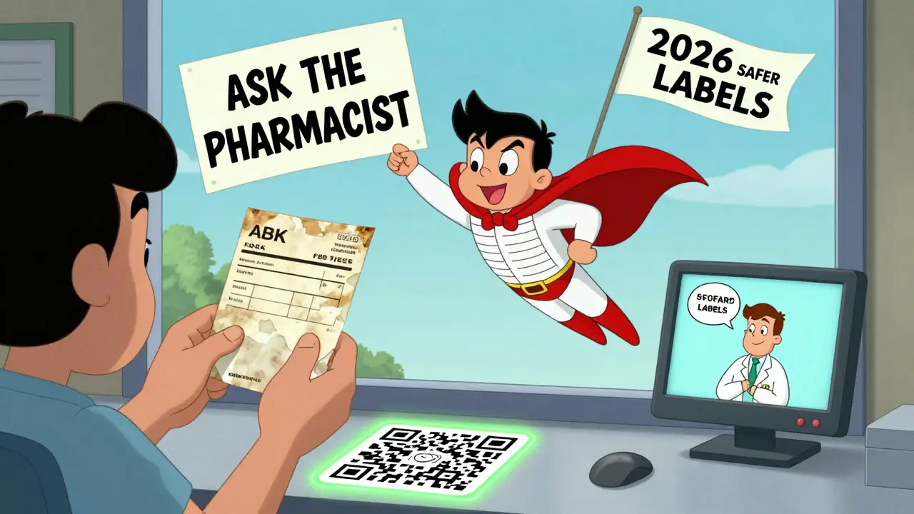
- Ask the pharmacist: "What’s the one thing I must not do?" That’s the most important warning.
- Use the "teach-back" method. After they explain, say: "So, if I take this with grapefruit, I could have low blood pressure - is that right?" If you can explain it in your own words, you understand it.
- Keep the info sheet. Don’t toss it. Save it in a folder with your other meds. You’ll need it when you see a new doctor.
There’s a new wave of change coming. By June 2025, the FDA will require simplified "Facts Labels" on 20 high-risk medications - things like blood thinners, insulin, and seizure drugs. QR codes on labels will soon link to short video explanations. But until then, you’re your own best safety net.
What’s Next for Prescription Labels
The future of medication labels is simpler, clearer, and smarter. The FDA’s new icon system is rolling out slowly. Hospitals are testing QR codes that play 30-second videos explaining side effects in plain language. Some pharmacies are even testing voice-activated labels - tap the bottle and hear the warning read aloud.By 2026, most major pharmacy chains will be required to use standardized, patient-friendly labels. But that’s not enough. The real fix? Making every pharmacist spend at least two minutes talking to every patient - not just handing over a bottle and a sticker.
For now, don’t assume you know what a label means. Don’t trust color alone. Don’t ignore the small print. And if you’re unsure - ask. Again. And again. Because in the end, no sticker, no symbol, no law can protect you if you don’t understand it.
What does a black box warning mean on my prescription?
A black box warning is the strongest safety alert the FDA requires. It means the medication has a known risk of serious injury or death - like liver failure, heart problems, or suicidal thoughts. It doesn’t mean you can’t take the drug, but you need to know exactly why you’re taking it and what signs to watch for. Always ask your pharmacist or doctor what the biggest risk is and what to do if you notice it.
Why do some labels say "take with food" and others say "take on an empty stomach"?
It depends on how your body absorbs the drug. Some medicines need food to reduce stomach upset or help absorption. Others are blocked by food - eating right before or after can stop them from working. "Take on empty stomach" means wait one hour before or two hours after eating. "Take with food" means eat something - even a snack - at the same time. Ignoring this can make your medicine useless or cause side effects.
Can I ignore a warning if I’ve taken the medicine before without problems?
No. Your body changes. Other medications you take may have changed. Your liver or kidneys might be working differently. A warning like "avoid alcohol" or "don’t drive" applies every time - not just the first time. Just because you didn’t get sick before doesn’t mean it’s safe. That’s how people end up in the ER.
What should I do if I don’t understand a warning?
Don’t guess. Don’t search online. Call the pharmacy where you picked it up. Ask them to explain it again - in plain language. If they’re busy, ask to speak with the pharmacist directly. You can also ask your doctor. It’s your right to understand your medicine. There’s no such thing as a dumb question when it comes to safety.
Are warning labels the same everywhere in the U.S.?
No. While the FDA sets the rules, individual pharmacies choose how to print and display the warnings. Some use color-coded stickers, others use plain text. Some include icons, others don’t. That’s why you might see the same medicine with different labels at different pharmacies. Always check the wording carefully - don’t assume it’s the same.
Is it safe to take my medication if the label is faded or peeling?
No. If the label is damaged, you can’t be sure what the warnings say. Take the bottle back to the pharmacy and ask for a new one with a clear label. Never guess what a faded warning says. It could be something like "Do not crush" - and crushing it could be dangerous. Your safety isn’t worth the risk.
Comments (8)
Alec Amiri
20 Jan, 2026I used to ignore the 'take with food' thing until I threw up all over my dog's bed at 3 a.m. Now I eat a cracker with every pill. Not glamorous, but my stomach thanks me.
Also, that 'do not crush' one? My grandma crushed her blood pressure pill because she said it 'tasted funny.' She ended up in the ER. Don't be her.
Just say yes to the sticker.
Lana Kabulova
20 Jan, 2026Black box warnings are not suggestions-they're red flags wrapped in legal paper. And yet, I’ve seen people shrug them off like they’re Netflix disclaimers. 'Oh, it says it might kill me? Cool, I’ll take it with my coffee.'
Did you know the FDA’s new icon system was designed by actual patients? Not lawyers. Not pharmacists. People who’ve been scared by their own meds.
Why are we still using 1990s design? Someone’s making money off confusion.
Rob Sims
21 Jan, 2026Oh wow, a whole article about reading labels? Groundbreaking.
You know what’s worse than confusing labels? People who don’t ask questions. You don’t get a free pass just because your pharmacist works at a chain with fluorescent lighting.
And no, ‘I’ve taken it before’ isn’t a medical defense. Your liver isn’t a vending machine that resets every time you walk in.
Also, QR codes? Cute. But if your pharmacist can’t explain it in 30 seconds, they shouldn’t be handing out life-or-death pills.
arun mehta
22 Jan, 2026This is such an important topic 🙏
In India, many people take medicines without reading labels because they trust the doctor completely. But here’s the truth: even doctors don’t always know every interaction.
I once saw a man take antibiotics with yogurt-and he didn’t know it killed the medicine. He got sicker.
Simple language saves lives. QR codes with voice explanations? Brilliant idea. We need this everywhere.
Let’s make health literacy a right, not a privilege. 💪❤️
Chiraghuddin Qureshi
22 Jan, 2026Bro, I’m from India and we don’t even get labels half the time 😅
My mom takes her pills from a plastic bag with a sticky note that says ‘morning pill’. No color, no symbols, no nothing.
But here’s the thing-we have community pharmacists who sit with you and explain it like you’re family.
Maybe the U.S. needs less tech and more human time.
Also, emoji for ‘do not crush’? 🚫🪓 maybe? 😆
Patrick Roth
24 Jan, 2026Actually, the FDA’s new icons are worse than the old ones. They’re designed by bureaucrats who’ve never held a pill bottle.
And ‘take with food’? That’s just corporate laziness. If your drug can’t be absorbed without a cheeseburger, maybe it shouldn’t exist.
Also, why are we still using paper labels in 2025? Why not Bluetooth-enabled bottles that buzz when you’re about to mix with alcohol?
Stop romanticizing the pharmacist. They’re overworked, not holy.
Lauren Wall
25 Jan, 2026My dad died because he thought 'avoid alcohol' meant 'don't drink wine at dinner.' He had one glass. It killed him.
Don't be him.
Read the sticker.
Kenji Gaerlan
26 Jan, 2026yo so i just looked at my label and it says 'do not crush' but my pills are like super hard and i can't swallow them so i just break em in half with my teeth. it's fine right? i've done it for years. my dentist says i need a new mouth tho so maybe that's the real issue 😅